Healthy Cafe Brand Design in Muscat, Oman
Creating a visual identity for a health-focused café and meal plan brand that balances nutrition with community.
Blue Dot is a health-focused café and meal plan brand based in Muscat, Oman, offering curated diet plans alongside an in-store café experience centered on community.
Project Overview
The brand approached us to develop a visual identity and packaging system that reflects both their nutritional integrity and their desire to build a health-conscious social space.
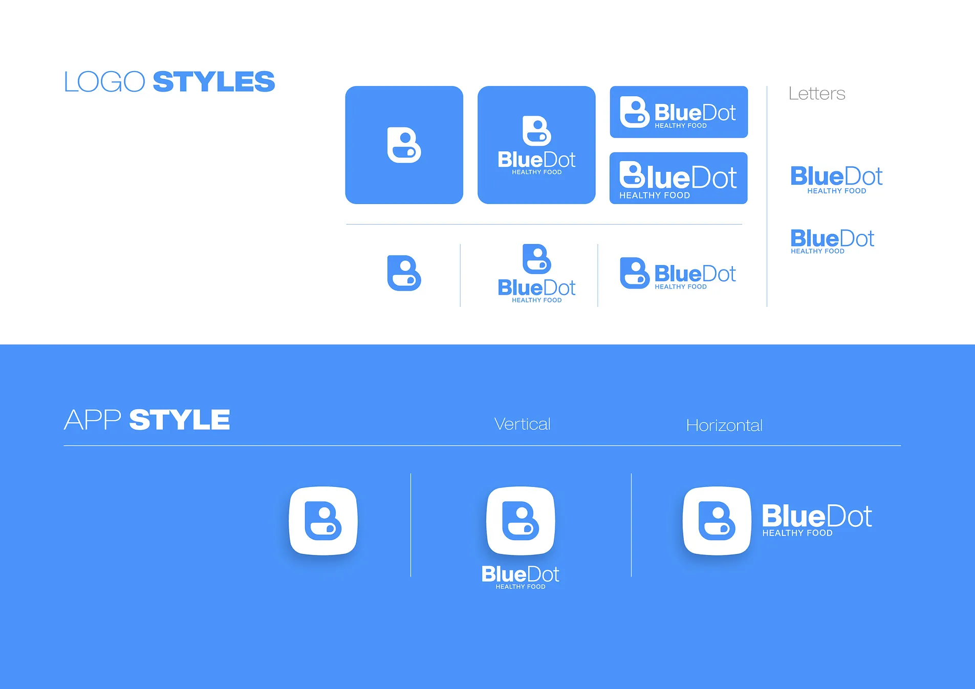
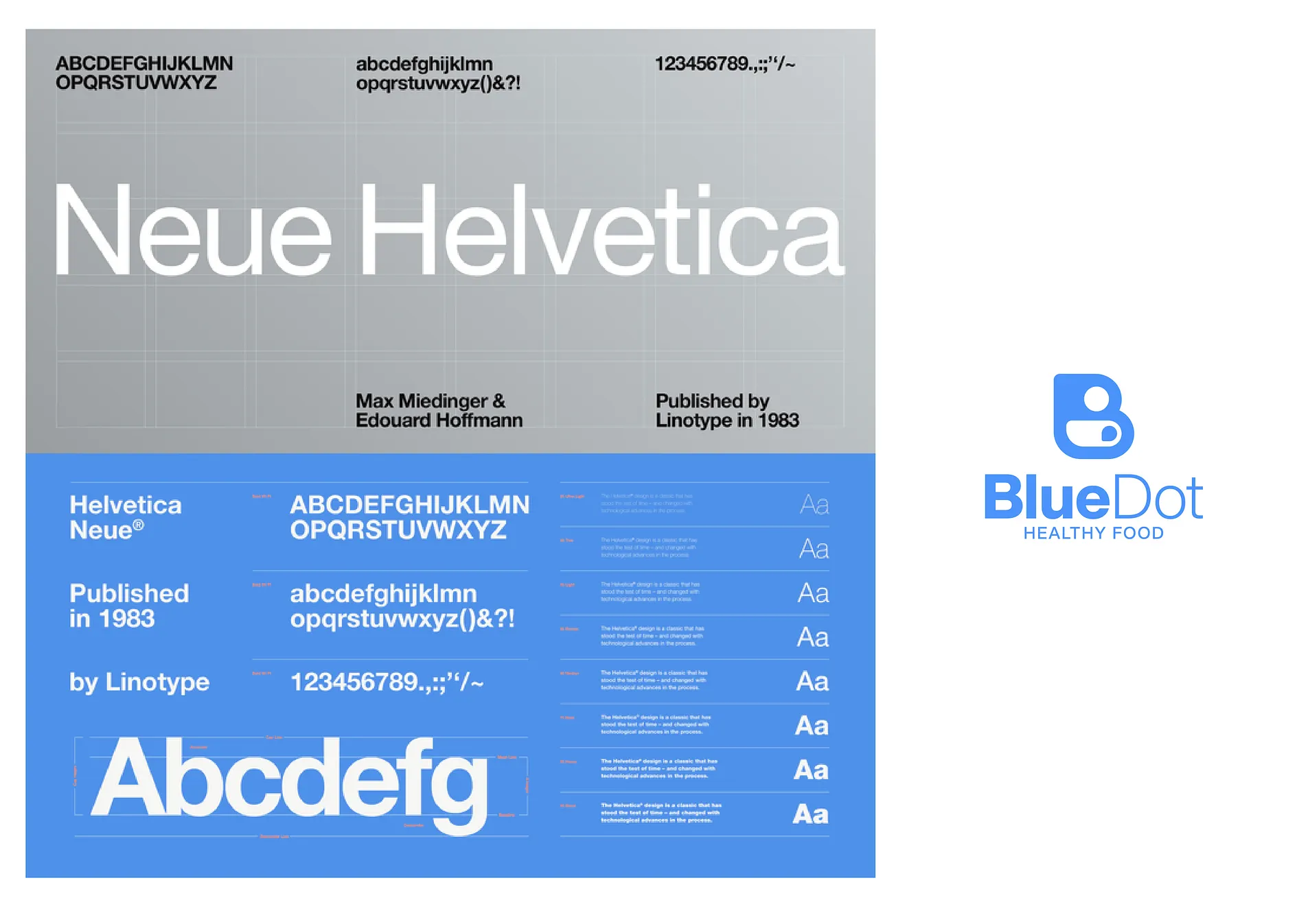
The challenge was to create a brand that could speak to both personal wellness and collective connection. From a logo that cleverly merges a bold dot, a "B", and a coffee cup, to a nostalgic yet premium type system, we built a visual language that resonates with trust, quality, and lifestyle.
Scope of Work
- Logo design
- Visual identity and brand system
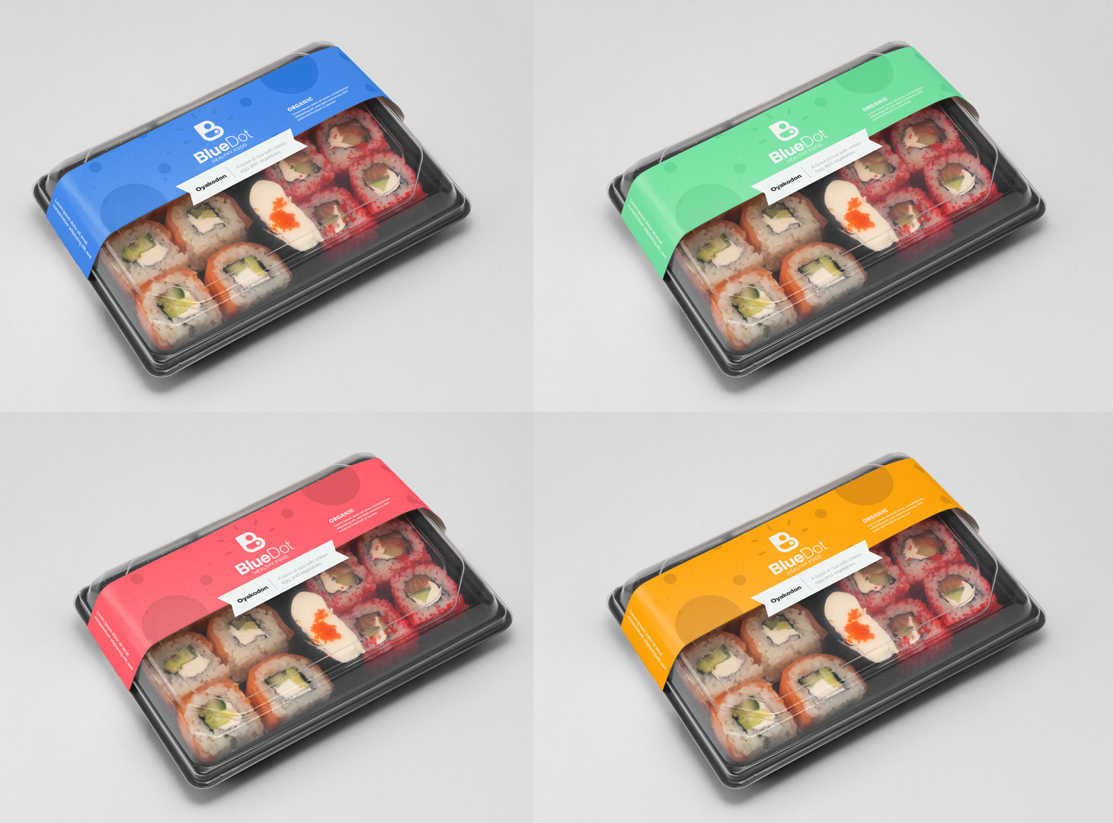
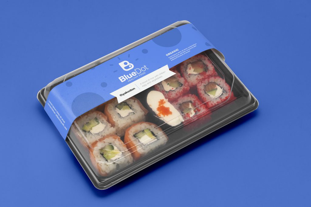
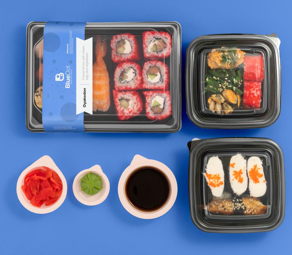
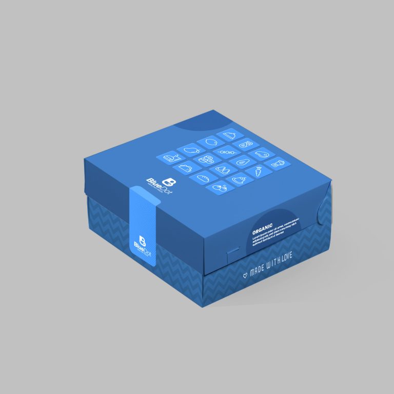
- Packaging design for health meal plans and café service
- Brand language aligned with local Omani design trends
- Visual storytelling centered on wellness and community
Process & Execution
Blue Dot entered the market with a dual focus: healthy lifestyle meal subscriptions and a café experience designed to build community. Their brand vision wasn't just about nutrition — it was about fostering a space where like-minded individuals connect through health and conversation. This philosophy deeply informed our approach to visual identity.
We began by anchoring the brand in a symbol that unites its three pillars: wellness, identity, and connection. The logo design brought together a bold blue dot, the letter B, and the subtle shape of a coffee cup. More than just a stylistic choice, this composition positioned coffee as a core symbol of the brand's community-building values.
Visual Language
The visual language extended this narrative into every aspect of the brand, from the clean, calming color palette to packaging that balanced functional quality with emotional resonance. Since the brand offered daily-delivered diet plans, it was critical to design packaging that met strict food safety and logistics standards — while still feeling personalized and high-end.
The café space itself was envisioned as a hub, and we created visual assets that could carry the brand's spirit across signage, merchandise, and interior cues — reinforcing the message that this is more than a café — it's a lifestyle space.
Outcome
Our design process resulted in a brand that is not only practical and professional but also deeply human. The visual identity system we created reflects both the precision of health-focused service and the warmth of social connection. Today, Blue Dot stands as a community-driven health brand, where the act of sharing a cup of coffee becomes an entry point into a healthier, more connected life.